13 min read · Updated 7 May 2026
The colour of a rug is probably the hardest decision to settle in any decorating project. Once size and material are fixed, colour decides about 80% of the room's final mood.
It is also where regrets are most common: a beige that turns out too pink against an ecru sofa, a midnight blue that darkens a room with no sun, an on-trend terracotta that dates faster than expected. This guide runs through the eight points that make the difference when choosing the colour of a rug for a living room or bedroom.
1. The 60-30-10 rule: the basis of every colour combination
Before you even look at a rug, you need to understand how a coherent colour palette is built in a room. The 60-30-10 rule, borrowed from professional interior design, gives you a simple, repeatable framework.
1.1 How the 60-30-10 breaks down in a room
In a balanced palette, 60% of the room is dominated by a main colour: usually the colour of the walls, the floor and the large surfaces (ceiling, windows). 30% comes from a secondary colour: the sofa, the curtains, a large piece of furniture, the bookcase. 10% makes up the accents: cushions, vases, small lamps, artwork, and the rug when it is used as an accent piece.
1.2 Where the rug sits in that breakdown
A rug can take two different positions in the rule. Either it joins the dominant or secondary colour (a neutral rug that extends the floor and the sofa) and becomes a discreet visual backdrop. Or it plays the role of a strong accent, in a decisive colour that contrasts with everything else, and becomes the focal point of the room. Both strategies work. The trap is a rug that is neither neutral enough to recede nor strong enough to own its accent role: the result is a room that looks unfinished.
2. Warm undertones vs cool undertones: the 30-second test
This is the technical detail few buyers have mastered, and it explains why two “beige” colours can refuse to sit together in the same room. Every colour has an undertone that is either warm (yellow, red, orange) or cool (blue, green, grey).
2.1 Identifying the undertone of your sofa and your walls
The simplest test: hold a sheet of white paper next to the sofa or the wall. If the surface seems to lean towards pink, gold or peach, the undertone is warm. If it seems to lean towards blue, grey-green or mauve, the undertone is cool. Pure neutrals (true white, mouse grey) have very little undertone and go with everything, but they are rare in real furniture.
2.2 Why a pink-toned beige clashes with a green-toned beige
The most common mistake is choosing a beige rug without checking the undertone of the sofa. An ecru linen sofa with a golden-yellow undertone calls for a beige rug with a warm undertone (sand, cappuccino, golden linen). A pearl grey linen sofa with a blue-green undertone calls for a beige rug with a cool undertone (greige, green-toned taupe). Mixing the two creates a dissonance that is subtle but visible: the room never quite settles. To confirm your instinct, the cream and beige rug collection offers a range of shades from golden sand to cool taupe.
3. The neutrals: beige, grey, white, black, brown-taupe
Neutrals alone account for more than half of all rug sales in France. Easy to work with and visually long-lived, they survive a change of sofa without looking dated. Five main families cover most of the demand.
3.1 Beige: the timeless all-rounder
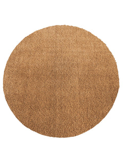
Beige is the most bought colour for a living room. Its warm neutrality heats up a room without stamping itself on it. The shades run from very light off-white to deep cappuccino, taking in sand, linen and ivory along the way. Beige works with any style (japandi, Scandinavian, classic, contemporary) and with any colour of sofa. For inspiration, see the cream and beige rug collection.
3.2 Grey: reassuringly contemporary
Grey is the urban living-room colour par excellence. From very light pearl grey to deep anthracite, it offers endless shades to suit every kind of light. Grey works particularly well with navy, forest green and terracotta sofas, and with light wood or polished concrete floors. See the grey rug collection.
3.3 White and ecru: the sense of space
White and ecru are the colours that make a room look bigger. Best kept for households without toddlers or pets (upkeep is more demanding), they create a bright, minimalist mood. Go for tone-on-tone patterns or textures (looped, braided) to avoid a flat effect. Ecru, warmer than true white, sits close to a very light beige and makes a sensible compromise. See the white rug collection.
3.4 Black and anthracite: character, fully owned
Black is the hardest colour to work in, but also the most striking when the dose is right. Ideal for a contemporary living room with a strong point of view, it sets a firm frame that structures the furniture. It is often used as a geometric pattern on a light ground rather than as a plain rug, which keeps it from feeling heavy. Avoid it in dark or sparsely furnished rooms. See the black rug collection.
3.5 Brown and taupe: natural warmth
Brown and taupe are the warm neutrals that have come back strongly since 2025. Deeper than beige, softer than black, they create a cocooning mood that suits north-facing living rooms and bedrooms especially well. Excellent with a cognac leather sofa, camel velvet or ecru linen. See the brown and taupe rug collection.
4. Bright and accent colours: terracotta, blue, green, red, pink, purple, gold, multicoloured
Bright colours ask for more commitment, but they are the ones that transform a room outright. The safety rule: the rug colour should pick up a colour already present in the room (a cushion, a curtain, a vase, a picture) to create visual coherence.
4.1 Terracotta and orange: the warmth of 2026
Terracotta has been the most requested colour since 2024 and continues to rise in 2026. Inspired by Mediterranean fired clay, it brings warmth and brightness without tipping into an aggressive red. Ideal with an ecru, pearl grey, off-white or sage green sofa. Avoid pairing it with a red, dark brown or pink sofa. See the orange and terracotta rug collection.
4.2 Blue (from midnight to petrol): depth
Blue is the colour that covers the widest range of uses. From deep petrol blue to Scandinavian pale blue, taking in premium midnight blue and contemporary Klein blue, it works with almost every neutral. Midnight blue in particular gives a classic living room a premium character. See the blue rug collection.
4.3 Green (forest, sage, olive): nature returns
Green has come back into interiors in a big way since the enthusiasm for biophilic (nature-led) schemes. Soft sage green brings calm and serenity, ideal in a bedroom. Deep forest green sets a strong character in a living room, especially alongside dark wood furniture. Warmer olive green is the on-trend alternative for 2026. See the green rug collection.
4.4 Red, pink, purple: for the bold
These three are the most committing colours in the catalogue. Red is the traditional accent par excellence, particularly in oriental patterns and classic pieces (think Persian rugs or an updated Berber look). Powder or raspberry pink brings softness and a feminine touch, ideal in a bedroom or study. Deep purple or plum creates a rich, unexpected mood, best kept for rooms that do not bask in daylight. See the red rug, pink rug and purple rug collections.
4.5 Gold, yellow and multicoloured: being bold without going wrong
Gold and yellow instantly warm up a dark room and create a sunlit note you notice from the doorway. Use them as a strong accent on a neutral ground, never piled up. Multicoloured is the answer for lovers of pattern and mixed styles (kilim, Berber look, Persian). Judged well, it becomes the focal point that brings the room to life. See the yellow and gold rug and multicoloured rug collections.
“The colour of a rug is a room's first silent impression.”
5. Choosing by room (living room, bedroom, hallway, kitchen)
The same colour does not play the same role depending on the room you put it in. Here are the recommendations by living space.
5.1 Living room: unifying neutral or accent colour
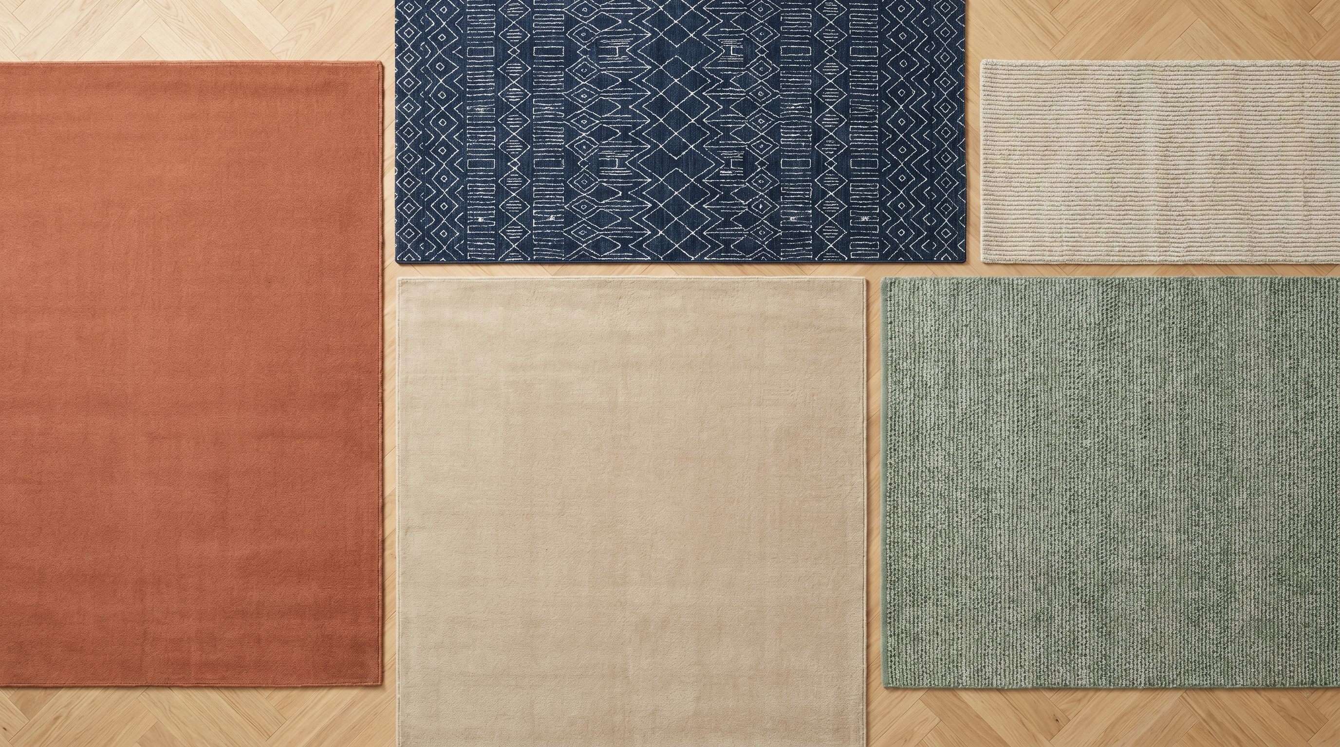
For a main living room, two strategies work. The first: a neutral rug (beige, grey, ecru, taupe) that structures the space without competing with the sofa. That is the choice for longevity and versatility. The second: a strong accent rug (terracotta, midnight blue, forest green) that becomes the focal point of the room. This strategy calls for a deliberately neutral sofa so the scheme does not become overloaded. To go further on living-room rugs, read our complete guide to choosing a living-room rug.
5.2 Bedroom: soft, calming tones
A bedroom calls for calming, restful colours: sand beige, pearl grey, sage green, powder pink, pale blue. Bright colours are best avoided in a room dedicated to sleep. If you want an accent, choose a discreet tone-on-tone geometric pattern rather than an outright bright colour.
5.3 Hallway and corridor: forgiving colours
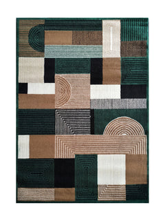
The hallway and the corridor are the areas most exposed to dirt and footfall. Go for mid to dark colours (anthracite grey, midnight blue, taupe brown, patterned multicoloured) that hide shoe marks, water traces and dust. Avoid white and ecru, which need daily attention.
5.4 Damp rooms: colour and light
In a kitchen or a bathroom, the rug colour has to work with lighting that is often artificial and with hard surfaces (tiles, stainless steel, ceramic). Light colours (off-white, beige, pale grey, pale blue) visually extend the floor and add light. Geometric patterns bring character without making the room feel busy. For the bathroom specifically, read our bathroom rug guide.
6. Choosing by decorating style (japandi, dopamine, classic, minimalist)
Four major decorating trends dominate French interiors in 2026. Each has its own favourite rug colours.
6.1 Japandi: pared back with natural warmth
Japandi combines Japanese restraint with Scandinavian warmth. Rug palette: sand beige, off-white, ecru, soft taupe, pearl grey. Patterns are extremely discreet and the feel is natural (wool, Tencel, cotton). Avoid bright colours and pronounced geometric patterns, which break the minimalist spirit.
6.2 Dopamine decor: waking a room up with colour
Dopamine decor relies on bright, joyful colours to lift the mood in gloomy times. Rug palette: true terracotta, saffron yellow, Klein blue, emerald green, raspberry pink. One outright bright colour on a neutral ground, the sofa stays quiet, the rug takes the stage. Suited to family spaces and to very bright daytime rooms.
6.3 Classic revisited: timeless patterns
Classic revisited marks the big return of rugs with updated traditional patterns: Persian designs in faded tones, a contemporary Berber look, kilims in washed palettes. The colours are softer than in the original versions (washed beige, faded terracotta, bleached petrol blue) so they fit into contemporary interiors. See the Persian rug and Berber-style rug collections.
6.4 Warm minimalism: the logical next step after strict minimalism
Warm minimalism is the 2026 evolution of the strict minimalism of previous years. Rug palette: taupe grey, soft terracotta, warm ivory, off-white, with organic geometries (curves, ripples) rather than strict straight lines. It is the default choice for a contemporary city flat that wants to avoid both the coldness of all-white and the overload of dopamine decor.
7. The decision table by sofa and mood
To make the rug colour choice clearer according to your sofa and the mood you are after, here is a practical summary table.
| Sofa colour | Mood you want | Recommended rug colour |
|---|---|---|
| Ecru / beige linen | Calm and neutral | Sand beige or ivory rug, tone on tone |
| Ecru / beige linen | A dynamic lift | Terracotta or midnight blue rug |
| Midnight blue velvet | Hushed elegance | Anthracite grey or taupe rug |
| Forest green velvet | Deep and natural | Ivory or terracotta rug |
| Terracotta velvet | Mediterranean | Cream or pearl grey rug |
| Cognac leather | Warm vintage | Multicoloured kilim or taupe rug |
| Mouse grey fabric | Urban contemporary | Off-white or petrol blue rug |
| Black fabric | Character, fully owned | Light grey or patterned off-white rug |
| Powder pink velvet | Soft and feminine | Off-white, pearl grey or sage green rug |
| Teal blue velvet | Bold and premium | Sand beige or golden taupe rug |
8. Testing the colour before you buy: samples and 30-day returns
A colour always looks different on a screen, in a photograph and in your west-facing living room at 5pm. At Casemira, two complementary services make the colour choice safer.
For Handmade designs and some Easy Clean washable models (127 eligible references in total across the catalogue), Casemira offers a sample service: a 20 x 30 cm cutting of the exact material is delivered to your door. Each sample costs €10 including delivery, an amount that is deducted in full when you buy your rug. You can explore the designs available as samples in the samples collection.
For the other designs in the catalogue that are not covered by the sample service, free returns within 30 days let you test the rug's colour at home with no risk. If the shade does not suit your interior, the refund is issued within 14 days of receipt. Our French-language customer service team is available Monday to Saturday, 8am to 8pm on 02 59 66 01 35 or by email at contact@casemira.com for advice before you buy.
Three Casemira rugs for the living room
 Beige and Grey Berber Rug - Torino
 Grey Geometric Rug - Arcano
 Taupe Abstract Washable Rug - Miro
Your questions about rug colour
Can you put a dark rug on a dark floor?
Yes, but it is a strategy of owning your character rather than of opening up the space. On dark oak flooring or dark polished concrete, a rug in close tones (anthracite grey, brown, midnight blue) creates an enveloping, almost lounge-like mood.
The room feels more intimate but also smaller. To keep the light, add generous indirect lighting and light-coloured cushions to break up the dark mass visually.
Does rug colour make a room look smaller or larger?
Light colours (off-white, ecru, sand beige, pearl grey, pale blue) visually extend the floor and give the illusion of a larger space.
Dark colours (anthracite, midnight blue, brown, forest green) carve the space up and make it more intimate. In a small room, go for light neutrals.
Should the rug match the curtains?
Not exactly the same colours, but colours from the same family (consistent undertones). If your curtains are golden beige, a golden taupe rug works better than a green-toned taupe.
The aim is not uniformity but harmony: rug and curtains should talk to each other, not look alike.
What is the rug colour trend for 2026?
Three colours lead the 2026 trends:
1. Terracotta, still rising since 2024 in all its variations.
2. Soft sage green, carried by the biophilic movement and by calming interiors.
3. Warm brown-taupe, the return of deep neutrals gradually replacing all-over grey.
Which rug colour hides stains best?
Three factors come into play: colour (mid to dark tones hide more than light or very dark tones), pattern (geometric rugs camouflage small marks better than plain ones), and material (Easy Clean designs add a water-repellent finish that buys you time to act before a stain soaks in).
How can you change the mood of a room without repainting?
The rug is the fastest and most reversible tool for changing a mood. Swapping a neutral rug for a terracotta one instantly warms up a room that felt cold.
Compared with painting, which takes two or three days and commits you for a long time, changing a rug takes five minutes for an immediate effect.
Written by the Casemira team. Based in Brittany, our team curates more than 900 rugs to help you find the one that feels like you. Find out more about Casemira.